How to build a landing page that converts
How to build a landing page that converts visitors into booked clients: the page structure, the one action, and the mistakes that quietly cost you.
Most founder-led businesses do not have a traffic problem. They have a landing page problem. You can send a hundred interested people to a page, and if that page is not built to do one job, most of them leave without ever raising their hand. A landing page that converts is not about clever design or a louder headline. It is about making one decision feel easy. If you would rather skip the theory and look at your own page together, you can book a free discovery call and we will walk through it. Otherwise, here is exactly how a page earns the click.
TL;DR: A landing page that converts does one job for one visitor: it makes a single promise, backs it with a little proof, states the offer plainly, and asks for one action. Most pages fail because they try to do everything at once, so the reader freezes and leaves. Match the message to why people arrived, remove every extra link, and point the whole page at one clear next step.
What makes a landing page convert?
A landing page converts when the visitor can answer three questions in a few seconds: Am I in the right place? Can I trust this? What do I do next? That is the whole game. Everything that helps answer those three questions belongs on the page. Everything else is a distraction, and distraction is the quiet enemy of conversion.
The mistake we see most often is treating a landing page like a smaller homepage. A homepage is built to let people explore. A landing page is built to remove choices, not add them. When you give a stretched-thin reader six things they could click, you have not given them options. You have given them a reason to put it off, and “later” almost always means never.
So the first principle is subtraction. Before you add another section, ask what you could take away. The strongest pages we build for clients usually do less than the founder first expected, and they do that one thing without apology.
The anatomy of a landing page that converts
Once you accept that the page has one job, the structure almost writes itself. From top to bottom, a page that earns the action tends to follow the same shape.
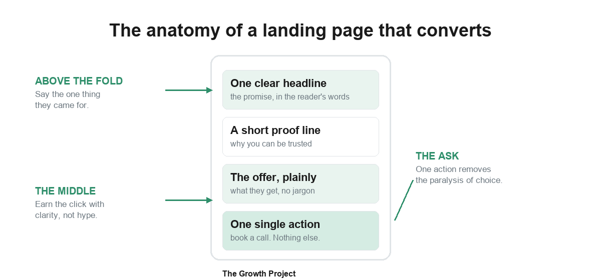
At the top, above the fold, you say the one thing the visitor came for, in their words, not yours. This is the promise. If your headline could sit on a competitor’s page without changing a word, it is too generic to do its job. Name the specific outcome the specific person wants.
In the middle, you earn the click with clarity rather than hype. A short line of proof helps here: a real result, a recognizable name, a guarantee you actually honor, or a simple, honest explanation of how the thing works. You are not trying to impress. You are trying to lower the reader’s guard enough to act.
At the end, you ask for one action. Not “book a call, or download the guide, or follow us.” One. The cleaner the ask, the more people take it. If you have spent any time wondering how to get more clients without burning out, this is where most of the leak is hiding: a good offer buried under too many competing buttons.
Why do most landing pages quietly fail?
Most pages do not fail loudly. They get visits, they look fine, and they simply convert worse than they should, so nobody sounds the alarm. Three patterns cause the bulk of it.
The first is a broken promise. The ad, post, or link that sends people to the page says one thing, and the page says another. The visitor feels the mismatch in a second and bounces. The fix is boring and powerful: make the first line of the page echo the exact phrase that got them to click.
The second is asking for too much too soon. A cold visitor is not ready to “start now” or hand over a long form. Lower the first step. A short, low-pressure action, like a free call or a quick plan, converts far better than a big commitment from someone who just met you.
The third is too many choices. This is the one founders underestimate the most.
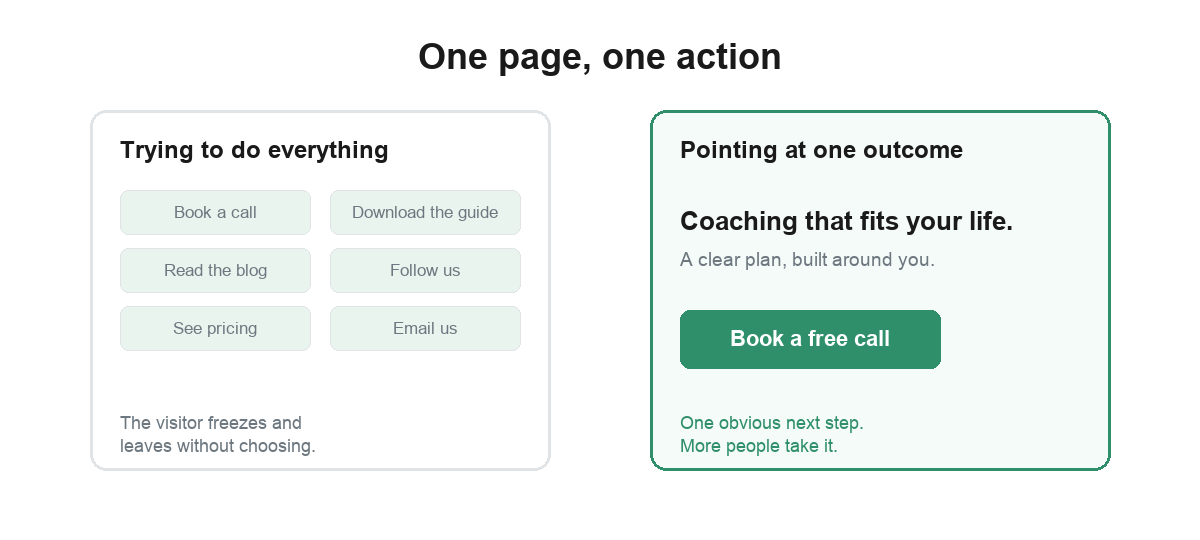
When everything on the page competes for attention, nothing wins it. The page that points at one outcome, with one obvious next step, beats the busy page almost every time, even when the busy page is better written.
How do you know if it is working?
You do not need a complicated setup to read a landing page. You need to know two numbers and watch them honestly. The first is how many people who land on the page take the action you want. The second is where people drop off on the way there. If almost nobody gets past the first screen, your promise is off. If they read the whole thing and still do not act, your ask is too big or too vague.
Resist the urge to redesign the whole page on a hunch. Change one thing at a time: the headline, then the proof, then the single call to action. Small, specific changes teach you what your audience actually responds to, and that knowledge compounds across every page you ever build.
This is also where deciding what to build, and who should build it, matters. If you are weighing whether to handle this in-house or hand it off, our honest take on whether to hire an agency or work with one partner walks through that exact call.
A simple order to build it in
If you are starting from a blank page, build it in this order so you never get lost in design before the message is right. Write the one promise first. Write the single action second. Add only the proof that makes that action feel safe. Then, and only then, think about layout and images. Design should serve the message, never lead it.
Keep one rule above all the others: one page, one visitor, one action. Hold that line and your page gets simpler and stronger at the same time. Break it, and you are back to a busy page that everyone visits and nobody acts on.
A landing page that converts is one of the highest-return things a founder-led business can fix, because it turns the attention you already earn into booked clients instead of bounces. If figuring out the digital side is pulling you away from the work you are great at, that is exactly what we take off your plate. Book a free discovery call and we will map out your Growth Plan together, starting with the page that should be doing the most work for you.
Frequently asked questions
What is the difference between a landing page and a homepage?
A homepage is a hub. It introduces everything you do and lets people wander. A landing page has one job: take a specific visitor, with a specific reason for arriving, and move them toward one specific action. A homepage answers 'who are you?'. A landing page answers 'should I take this next step, right now?'. The more you try to make one page do both, the worse it does either.
How long should a landing page be?
As long as it needs to be to make one clear case, and not a word longer. A simple offer for a warm audience can convert in a single screen. A higher-commitment offer for a colder audience usually needs more room to handle doubts. Length is not the lever. Clarity is. A long page that says one thing well beats a short page that says five things vaguely.
Why is my landing page getting traffic but no bookings?
Almost always one of three things: the page promises something different from the ad or link that sent people there, it asks for too much too soon, or it gives the visitor more than one thing to do so they do nothing. Match the promise, lower the first ask, and cut the page down to one action. That fixes most quiet conversion leaks.
Do I need a separate landing page for each campaign?
Usually yes, if the campaigns speak to different people or different problems. The whole point of a landing page is that the message on the page matches the reason the visitor clicked. One generic page for every source forces a compromise message that fits no one well. Separate pages let each one stay specific, which is what actually converts.
Want a clear roadmap for your own growth?
Every partnership with The Growth Project starts with a free Growth Plan. Book a discovery call and we'll map out yours together.